Mobile SEO Tips & Strategy Guide to Dominate Search

You’ve probably thought about your desktop SEO a lot. But have you given just as much thought to your mobile SEO? With more and more internet users connecting via mobile devices, mobile search engine optimization is critical in helping you connect with all audiences online.
The fact is that Google uses the mobile version of websites when indexing and ranking pages, meaning that the mobile user experience (UX) impacts both search visibility and user conversion.
In this mobile SEO guide, Keely McGroarty, SEO Strategist, will go into what mobile SEO is, some of the main elements to include in your efforts, and a few tools that can simplify optimization for your website.
What You’ll Learn
What is Mobile SEO?
Mobile SEO is a marketing tactic that entails optimizing a website’s mobile user experience, content structure, technical accessibility, performance, and search visibility for audiences using smartphones and tablets.
The process uses a combination of on-page, off-page, and technical SEO while implementing responsive design that creates a seamless experience across devices.
Mobile SEO vs Desktop SEO
While very similar to desktop SEO, mobile SEO has a few notable differences to keep in mind. Mobile SEO tends to focus more on the user experience and optimizing content for mobile searches. Most of the time, mobile users are searching for quick information. They need fast-loading pages, a responsive design, and touch-friendly navigation. They don’t have time to figure out how to navigate an unfriendly website.
Here is a breakdown of the differences between SEO for mobile and desktop optimization:
| Optimization Area | Mobile SEO | Desktop SEO |
| Indexing | Google engages in mobile-first indexing, making it crucial to develop a mobile version of your site for more efficient crawlability and indexing | While search engine crawlers still work to index desktop pages, mobile takes top priority |
| Page Layout | Vertical, single-column layouts with large text and easy navigation | Multi-column layouts with larger images, menus, sidebars, and information blocks |
| SERP Display | More images, videos, and other visual elements, along with rich results, map packs, and zero-click AI Overviews | Traditional text snippets appear longer, with more expansive SERPs featuring side-panel knowledge graphs, text extensions, and sponsored results toward the top of the page, as well as AI Overviews |
| Local Intent | Often very high local intent, with users conducting quick searches for local businesses, such as restaurants, retailers, and service-based businesses | Lower local intent than mobile, with more queries focused on in-depth research and seeking information, along with more extensive browsing of ecommerce and other sites |
| Page Speed Requirements | Requires the fastest loading times to satisfy quick searches, with the need for file size optimization, and lightweight code | Ultra-fast page speed is important, but not as essential as it is for mobile devices, relying more on users’ stable Wi-Fi or broadband connections over 4G (LTE) or 5G |
| Form Design | Needs simplified form completion with click-to-select options, minimal fields, and autofill capabilities | Allows for more detailed forms requiring users to enter and type more information |
| Calls-to-Action (CTAs) | Convenient, tappable buttons are ideal, and they should be large and clear | Desktop users can access contextual CTAs throughout content, and they can take time to scroll before encountering them |
| Measurement and Tracking | Device-specific metrics with a focus on Core Web Vitals, local position tracking, and mobile conversion rates | Traditional engagement metrics like time spent on page, bounce rates, desktop-specific conversions, and other goal-relevant key performance metrics (KPIs) |
The Role of Mobile SEO Services in a Digital Marketing Strategy
Regardless of the type of business you run, mobile SEO can have a huge impact on your website’s performance. You’ll connect with more users who might otherwise not find you, create the ideal mobile experience to keep users engaged once they land on your site, and ultimately dominate competitors that aren’t as mobile-optimized.
Mobile SEO is especially important for brick-and-mortar businesses that want to cash in on local searches. For example, if you’re a pizza restaurant, you should absolutely optimize your site so that it comes up first when someone uses their cell phone to search “pizza in [neighborhood].” If you don’t, you’re missing out on valuable traffic!
How Mobile-First Indexing Works in 2026
Mobile-first indexing is how Google’s algorithm approaches search engine rankings, meaning that search engine bots crawl mobile websites before desktop versions, whereas the old-fashioned algorithm used a desktop-first model.
Mobile-first indexing takes into account a website’s user-friendliness and overall responsiveness when indexing. Because of this, you must focus on making your website ideal for mobile users along with their desktop counterparts. Otherwise, simply optimizing for desktop devices could compromise your rankings.
You can ensure your site appeals to mobile-first indexing with the following checklist to optimize SEO for mobile search:
- Keep the same primary content
- Maintain the same metadata, i.e., title tags and meta descriptions appearing in search engines
- Optimize schema structured data on both versions
- Implement crawlable CSS, JavaScript, and images
- Prevent any blocked resources from impacting performance with proper robots.txt configuration
- Use equivalent internal links on mobile and desktop pages
My Expert Insight on Mobile SEO
The number of global mobile users continues to increase exponentially, and 73.62% of Google visitors come from mobile devices. Therefore, you need to optimize your SEO campaigns for mobile users to get and stay ahead of competitors online.
Without effective SEO for mobile phones, you’re missing out on a crucial opportunity to connect with mobile audiences, regardless of your industry.
Our team at Ignite Visibility has used mobile SEO to elevate multiple clients to the top of search engines, including a fitness franchise that optimized its local SEO for 1,500 locations to boost traffic by 25% with the help of a better mobile user experience and location pages. Another client, a leading home services brand, benefitted from mobile responsiveness and other technical SEO implementations to yield a 729% increase in AI visibility and 32% more leads.
By making your website mobile-responsive, ensuring page loading speeds are at their fastest, and optimizing for mobile searches, you can harness the power of mobile SEO to maximize your rankings and reach on search engines.

The 8 Mobile SEO Priorities That Matter Most
The following are some of the main elements of a strong mobile SEO strategy, along with some tips to help you get the most from them:
1. Use Responsive Design as the Default
A critical part of mobile SEO is a responsive design. Your website needs to be able to adapt quickly to mobile devices.
You can facilitate mobile responsiveness by maintaining your HTML file while using CSS to modify the page’s layout based on the size of the user’s screen. In turn, regardless of whether a user is on a desktop, smartphone, or tablet, they’ll see a website that corresponds to that device.
When working to create a mobile-responsive site, it’s best to maintain the same URL for all versions of the site, as opposed to designating a separate “www.yoursite.com” and a mobile-specific “m.yoursite.com” domain.

2. Make Mobile Content Complete and Easy to Scan
Your website’s content must also work for mobile users, with text and images that properly fit mobile screens for easy viewing.
For example, you can use short paragraphs that read better on narrower screens. Meanwhile, make sure image placements won’t disrupt the flow of content for mobile users.
Understand the importance of Content Delivery Networks (CDNs). CDNs can improve load speed and reduce latency to enhance user experience. Leveraging them can be especially important for content that will be distributed globally.
Image and video sizes should also fit mobile devices for a fully responsive user experience.
3. Improve Mobile Core Web Vitals
Users across all devices want to visit websites that load fast, but this can be more of a challenge for mobile users. Keep in mind that while the ideal page load speed is one to three seconds, web pages on mobile devices load 70.9% slower than they do on desktops.
Google used to automatically enable faster mobile loading through Accelerated Mobile Pages (AMPs), but the platform is moving away from the AMP model to focus on new technologies and practices.
Instead of optimizing for AMPs, you’ll need to optimize PageSpeed in accordance with Google’s Core Web Vitals guidelines. With the help of Google Search Console reports, you can monitor your web pages’ loading speeds and subsequently make any necessary improvements.
When running a report, you can see multiple factors that influence page speed, with a breakdown of each:

Optimizing image file sizes, text, and other elements on your page can help you increase page speed to improve the user experience and, subsequently, image SEO.
4. Make Navigation Thumb-Friendly
Your website’s mobile UX is also essential in boosting your site’s rankings on search engines. If people don’t continue to navigate your website after landing on it, this could negatively impact your SEO as Google doesn’t find it helpful to users.
Make sure your site is mobile-ready with optimized mobile navigation and overall usability. Can a smartphone user enjoy the same experience as someone on a tablet? Do objects on a page seem seamlessly integrated on a desktop but actively obstructive on a mobile screen?
You can improve the user experience for mobile by reducing clutter on each page and using various touch-friendly design elements. For instance, the buttons you use on each page should be responsive and make it easy for mobile users to tap on them, effectively carrying them to the next stage of the buyer’s journey.
5. Optimize Mobile SERP Appearance
When developing your meta titles and descriptions, make sure they work on mobile screens and avoid truncation.
Meta titles should be no more than around 50 to 60 characters to keep them from cutting off, and they should include a primary keyword toward the beginning. Meanwhile, meta descriptions should remain about 155 to 160 characters, with a unique value proposition, explanation of what the page is about, and a call to action, if appropriate.
Structured data will also help you appear in both traditional and AI search results, indicating to search engine bots what your content is about.
6. Strengthen Local Mobile SEO
If your business is locally based and you need to target audiences in specific areas, local SEO is everything.
Local SEO is particularly important for mobile devices, seeing as most local searches come from mobile devices.
You can optimize for mobile local SEO in a number of ways, such as:
- Getting relevant citations in directories
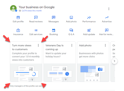
- Developing your Google Business Profile
- Using local keywords for mobile-friendly landing pages
- Creating mobile-responsive location pages
- Allowing for customer reviews
7. Optimize Mobile Conversion Paths
Keep people moving along the customer journey with your mobile SEO strategy by creating the straightest, most frictionless path to conversion.
You can do so by:
- Using sticky CTAs that stay on mobile users’ screen as they scroll
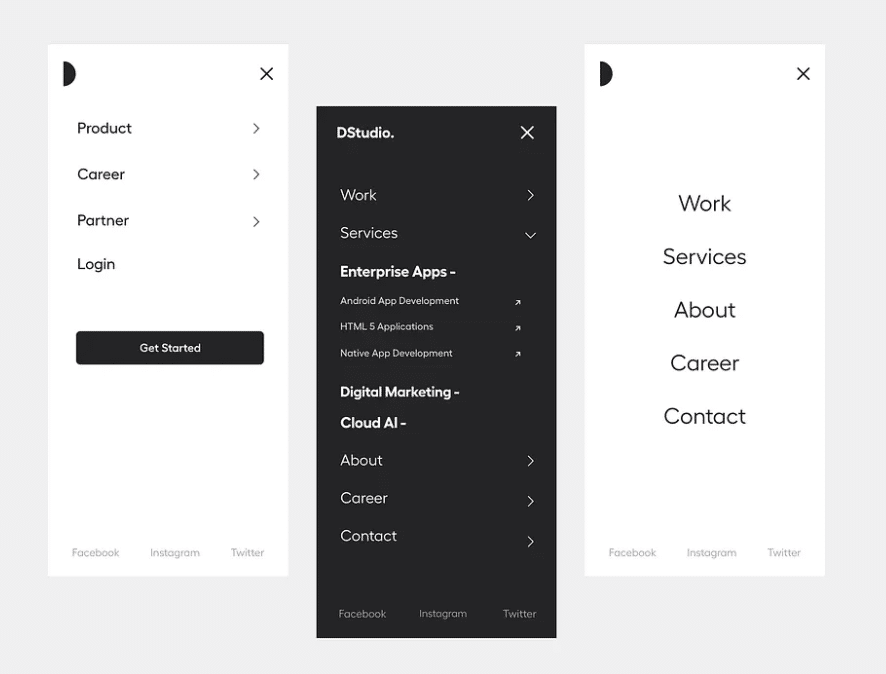
- Simplifying menus with the help of a hamburger menu that collapses into multiple options when tapped
- Removing non-essential fields in lead forms
- Enabling browser autofill
- Triggering the correct keyboard (e.g., words vs. numbers) depending on the type of text input required
- Offering one-click guest checkout on ecommerce sites
- Including a progress bar letting users know how close they are to completing a multi-step process
8. Build for Voice, AI Answers, and Question-Based Mobile Queries
With more and more people relying on voice search through devices like Amazon’s Alexa or Siri, it’s critical that you optimize your content to match those searches.
Voice search optimization requires:
- Using conversational language
- Incorporating long-tail keywords into your content
- Providing clear and concise answers to important questions
- Creating a FAQ page
- Using question-based terms that people would use when using a voice-activated device to search the web
In addition, optimize SEO for mobile search to appear in AI search results, including Google’s AI Overviews, AI Mode, and other answer engines like ChatGPT. Schema structured data can help here, along with well-structured, fresh, and helpful content that’s backed by data, experience, and expertise.
You can effectively optimize your mobile SEO strategy for both voice search and AI by targeting and answering question-based mobile queries that people are likely to ask. This is particularly the case with long-tail conversational queries that people might enter when looking for in-depth information in AI searches.
A Complete Mobile SEO Audit Checklist
To get the best results from search engine optimization for mobile search, take the following steps in our mobile SEO guide when auditing your existing processes:
1. Choose Sample URLs
Choose the corresponding mobile and desktop URLs you want to examine and compare, such as “m.example.com/audit-page/” and “example.com/audit-page/.”
2. Compare Mobile and Desktop Content
On the sample URLs, compare all content elements to gauge performance of SEO for mobile and desktop versions alike.
Some items to compare include:
- Primary copy format on the page
- Header tags and their hierarchy
- Alt text and media assets
- Structured data
- Internal links
Any mismatches could result in dropped rankings, weakened topical authority, and loss of appearance in featured snippets, rich snippets, and AI answers.
3. Inspect URLs in Google Search Console
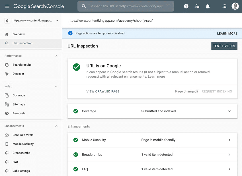
You can inspect your URLs to assess SEO for mobile search with the help of Google Search Console’s URL Inspection Tool.
For each URL, you can see if Google has indexed the page, whether the page is mobile friendly, and other aspects to determine whether it’s likely to achieve top rankings.
If there are any issues, GSC provides guidance on how to fix them.
4. Run PageSpeed Insights
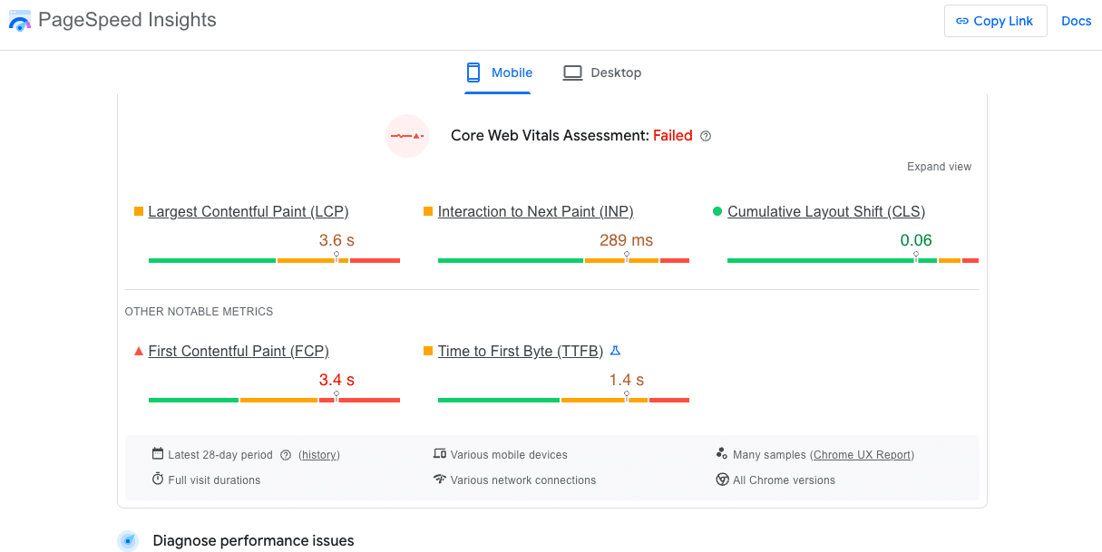
You can then run each URL through Google’s PageSpeed Insights to determine whether it appeals to Google’s Core Web Vitals metrics.
These metrics include:
- Largest Contentful Paint (LCP): Measures the time it takes for images, videos, and text blocks to render for each user.
- Interaction to Next Paint (INP): Assesses pages’ responsiveness to user behaviors by looking at latency for clicks, taps, and other interactions.
- Cumulative Layout Shift (CLS): Measures the amount of layout shifts that occur on the page when visible elements on a page change as users interact with content.
5. Test on Real Devices
Use different browsers and different devices to load your page, including desktop devices, smartphones, and tablets, noting any differences or issues experienced on any platform.
6. Check All Forms
Make sure forms are optimized for desktop and mobile URLs, with more comprehensive forms on desktop versions and shorter, cleaner ones on mobile pages.
7. Monitor Local Actions
Don’t just monitor mobile SEO performance directly; take a look at local actions among users to help figure out whether your mobile sites are gaining the kind of traction they should.
Specifically, look at:
- Direction requests
- Phone calls
- Website clicks
- Local lead form completions
8. Review Mobile Rankings
Conduct regular mobile SEO analysis with Google Analytics and other tools to track your rankings.
If you notice any overall low-performing sites or drops in rankings, take steps to optimize your content and technical SEO to help them recover.
Images, Video, and Visual Content on Mobile
Good mobile SEO will also implement well-optimized visual elements. Consider the following to help you improve SEO for a mobile site with images, videos, and other media:
- Responsive Images: You may want to enable images to change size and placement based on whether they appear on desktop or mobile screens.
- Matching Image URLs: When possible, make sure image URLs match for mobile and desktop versions.
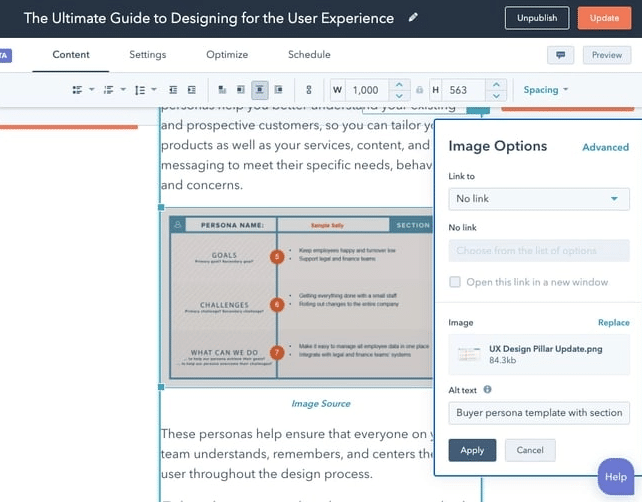
- Alt Text: Give Google more information about what an image contains with alt text describing the image content, which could help with visual search.
- Compressed Files: Compress image and other visual media files whenever you can to allow for faster loading.
- Mobile Video Placement: Videos on mobile sites should have the right placement to avoid disrupting the user experience, such as appearing toward the middle of the page to break up text blocks.
- Captions: Add captions to images and videos with relevant keywords, which could supplement alt text.
- Thumbnails: Use thumbnails for videos and related links that pop out on mobile screens and don’t feature too much text or cluttered imagery, keeping them clear and compelling across platforms.
- Avoiding Harmful Media: Don’t occupy too much page space with visual elements, as this could push key content farther down on mobile devices and increase friction.
Common Mobile SEO Mistakes to Avoid
Mobile SEO isn’t without its pitfalls. Knowing how to avoid these can help you get the best possible results with your strategy. Let’s get into some of these mistakes.
1. Blocking Content
One potential issue could involve blocking JavaScript, CSS, and images on your site. Ensure these elements are accessible and visible to mobile users, which will help Google bots crawl them for indexing while enhancing the mobile experience.
Keep in mind that Google warns against blocking any resources, along with mismatched content and mobile URLs with incorrect redirects.
2. Using Non-Supported Mobile Elements
Websites might also use Flash or other formats that aren’t compatible with mobile devices. Only use formats that work well with these platforms, such as plain text and HTML for text content, MP4 and H.264 video formats, MP3 and MP4 audio formats, and PDFs or EPUBs for text documents.
3. Poor Site Structure and Navigation
Mobile sites should be easy to view and navigate for users across all devices. Optimize your site’s responsive design and test it while also allowing for ease of navigation across the site.
4. Slow Mobile Page Speeds
If pages take too long to load, visitors on mobile sites won’t likely stick around. You can keep them glued to your content by optimizing images and other content to minimize page load times.
Pro-Tip: Reduce the amount of JavaScript and CSS bloat on your page, as excessive use of these tools can significantly slow down your site. Implement lazy loading for images and use next-gen image formats like WebP to streamline load speed.
5. Not Optimizing for Local Search
Local businesses must do what they can do optimize for local search. Having local listings, up-to-date Google Business Profile information, and other locally optimized content will help dominate local SEO. Filling your profile with pictures, posts, and reviews will improve your location-based search efforts.
6. Intrusive Pop-Ups
Avoid using any pop-ups that might impede users’ ability to navigate the screen and annoy them.
Consider using elements like sticky pop-ups toward the bottom of the screen that allow users to scroll and read content without hurting the user-experience. Exit pop-ups could also encourage more mobile users to take action without compromising navigation.
7. Poor Tap Targets
Your mobile site could also suffer from tap targets that make it hard for users to find or use them.
For instance, they might be too close together or too small, leading to accidental clicks that frustrate and ultimately turn away users. They might also feature poor color contrast to make it difficult to spot them on the page.
8. Missing Schema
Every mobile SEO strategy should implement schema structured data to improve performance on both desktop and mobile sites.
Use the most relevant schema markup based on the content of the page, which you can get help with by visiting the schema.org website and looking at different types.
9. Desktop-Only Internal Links
Internal links should be present on mobile sites when appropriate and point to other mobile URLs, which can help evenly distribute link equity on both your desktop and mobile sites.
10. M-dot Redirect Issues
Many sites with an “m.example.com” domain structure for mobile devices might experience redirect issues, specifically when a desktop URL redirects mobile users to a mobile equivalent that might not exist.
For example, when clicking on a link to your website using mobile devices, unless you have a mobile equivalent, those users might simply wind up on the homepage, culminating in an unhelpful experience that keeps people from moving down the funnel.
Today, it’s often best to avoid m-dot domains altogether and adopt a responsive design across URLs, eliminating the need to redirect.
11. Untested Forms
Rolling out lead forms without testing can lead to poor performance, especially if you haven’t ensured that mobile forms are properly optimized with minimal fields and simple designs.
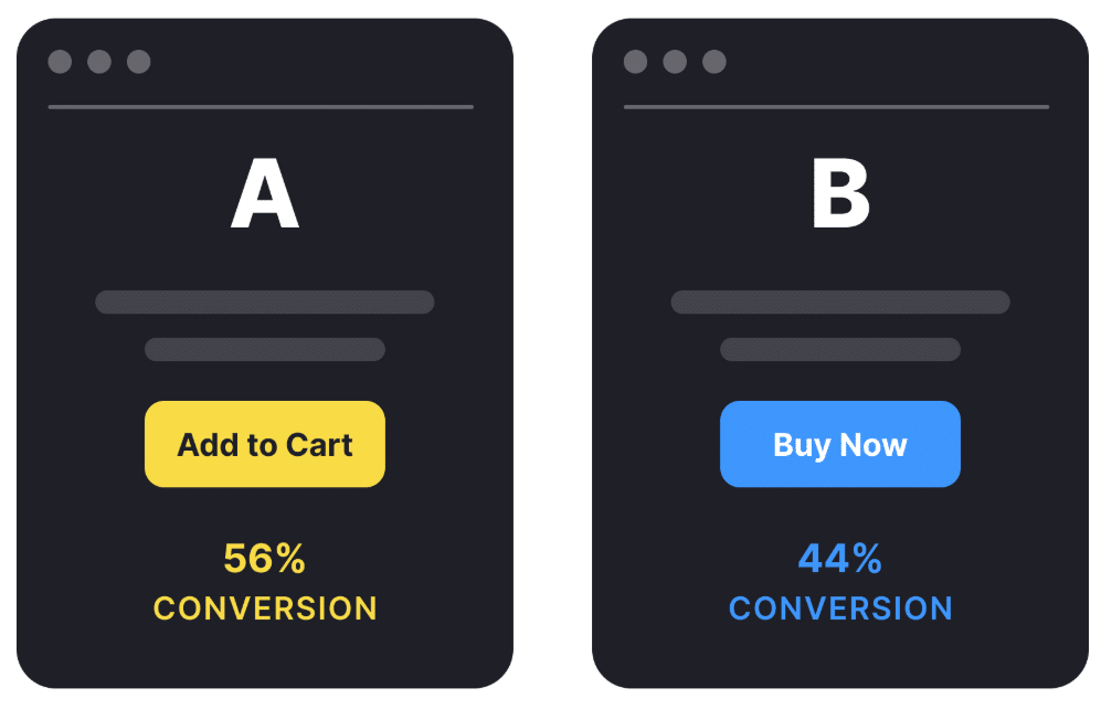
Consider running an A/B test to try out two different form variations with a single different element between them, such as placement or the number of fields. Based on which performs the best among mobile users, you can determine how to approach mobile vs. desktop forms.
Here are a few helpful mobile SEO tools I recommend for optimizing mobile sites, based on their specific jobs:
Technical Crawls
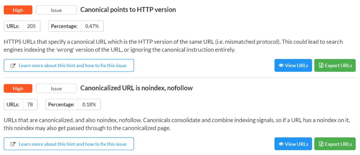
- Screaming Frog: One popular tool used to crawl all URLs and conduct SEO audits is Screaming Frog, which can pull all of the raw data needed to help identify and address technical SEO issues.
- Sitebulb: Using this platform, you can crawl your site and get performance data that helps optimize SEO for mobile search, with automated mobile SEO tips for improving performance.
Core Web Vitals
- Google Search Console: Get in-depth mobile reports using this platform, including Core Web Vitals and general performance reports, along with instructions for how to fix certain issues.
Real-User Data
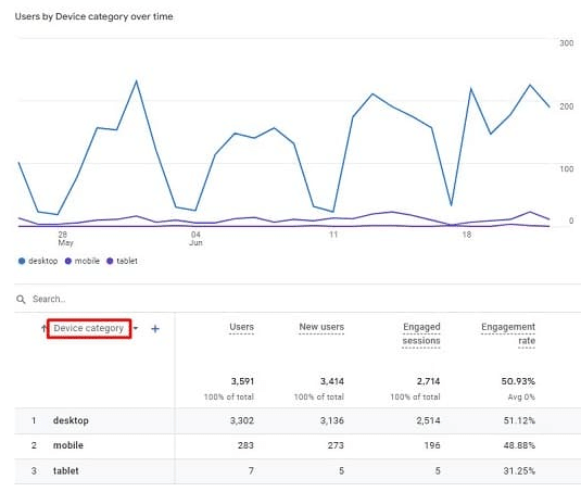
- Google Analytics 4: Get real-time user metrics for both desktop and mobile devices with GA4, including engaged sessions, engagement rate, average engagement time, and conversions based on designated conversion events.
SERP and Rank Tracking
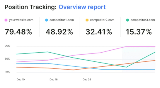
- Semrush: Semrush’s position tracking tool can give you clear insights into desktop and mobile site rankings, including trends over time, with the ability to compare your performance to competitors.
UX Testing
- Google PageSpeed Insights: Use this helpful tool to gauge your web pages’ loading speeds, including a detailed assessment of Core Web Vitals and performance issues slowing your site down.
- WebPageTest: Test your mobile speed using this free tool. It will test and analyze your mobile SEO and help you improve your website loading speed. This will help you monitor mobile SEO strategies and find ways to improve them.
- Lighthouse: This open-source tool will audit your page and generate a report of its successes and failures. Once you know what isn’t working, you can fix it to improve your site’s mobile experience.
- Bing Mobile Friendliness Test Tool: See how your website would perform on Bing for mobile users, complete with a preview of your site on a smartphone screen and a checklist for various elements.

Local Visibility
Schema Validation
Of course, with AI getting more and more involved in digital marketing, there are also some great AI-driven tools to help improve your mobile SEO.
- ChatGPT: When you use the right prompts, ChatGPT can provide valuable insight to improve your structured data markup, analyze loading speed, and improve the mobile experience of your site.
- SurferSEO: SurferSEO will provide you with tips on how to properly format your content, as well as optimize your site for voice search.
How to Measure Mobile SEO Success
You can both measure and monitor mobile SEO performance using the following key performance indicators based on your specific goals:
- Mobile Organic Traffic: Keep track of all organic traffic coming from traditional or AI search results on Google, Bing, or other search engines.
- Mobile Rankings: Monitor rankings for mobile pages to determine which are doing well and which need additional optimization to increase visibility.
- GSC Clicks and Impressions by Device: Using Google Search Console, look at clicks and impressions to gauge visibility and brand awareness efforts among mobile users.
- Core Web Vitals by Device: See whether Core Web Vitals differ for desktop and mobile users.
- Mobile Conversion Rate: Compare the number of people who convert to leads or customers on mobile devices to desktop metrics.
- Form Completions: The total number of mobile form completions can indicate whether you offer a frictionless mobile experience to convert users.
- Click-to-Call Events: The number of people who click on a button that automatically calls a local business.
- Bounce and Engagement Rate: A high bounce rate could indicate that your content is irrelevant or unhelpful or that your mobile experience needs work to keep people on a page.
- Local Actions: Measure direction requests, calls, in-store redemptions, and other types of local interactions involving mobile users.
- Revenue or Leads by Device: When trying to achieve conversion or ROI goals, pay attention to the total revenue and leads generated by desktop and mobile devices.
FAQs
1. What is mobile SEO?
Search engine optimization for mobile devices refers to a process involving the optimization of a site’s technical accessibility, experience, performance, search visibility, and content structure to boost rankings in search engines.
2. Why is mobile SEO important in 2026?
Considering Google prioritizes mobile websites when indexing and ranking, you need to optimize SEO for a mobile site to get the best possible results from your strategy. More and more people are using mobile devices to perform all types of searches, making it essential to optimize for mobile users.
3. What is mobile-first indexing?
Mobile-first indexing is the model that Google uses to crawl, index, and rank websites based primarily on their mobile versions. As a result, if you don’t have a mobile-friendly website, your overall SEO performance could struggle.
4. How do I check if my site is optimized for mobile SEO?
There are many ways to determine whether your site will connect with mobile search users, such as evaluating mobile friendliness and responsiveness, conducting a mobile SEO analysis of PageSpeed Insights and Core Web Vitals, and identifying any technical SEO issues that might hold your site back.
5. What are the most important mobile SEO ranking factors?
There are several key factors that can influence your mobile site’s performance, including:
Page speed and Core Web Vitals
Mobile responsiveness and layout
Technical mobile configuration
Mobile user experience
6. Is responsive design better for mobile SEO?
Yes, a responsive design that accommodates mobile users with different screen sizes will help you improve your rankings by improving the overall user experience, signaling to Google that your site is worth indexing and ranking.
7. How does mobile SEO affect local rankings?
SEO on mobile directly affects local rankings based on the fact that Google prioritizes mobile websites over desktop versions, with a growing number of search engine users conducting local searches using mobile devices. As such, a poor mobile user experience with poor optimization could keep you from achieving top rankings.
Elevate Your Mobile SEO Campaigns With Ignite Visibility
Want to succeed with mobile SEO? Ignite Visibility knows how to develop the ideal strategy for desktop and mobile users alike using innovative tools and best practices.
Our comprehensive mobile SEO services encompass all aspects of search engine optimization, from desktop to mobile, helping you achieve top rankings in your industry.
With our help, you can:
- Develop mobile-responsive websites that create a seamless experience on every device
- Create mobile-optimized content that connects with these users
- Optimize page load speeds to keep users scrolling
- Connect with local users via in-depth local search campaigns
- Work through a mobile SEO checklist
- Teach you exciting and effective mobile SEO techniques
- And much more!
Want to go beyond this mobile SEO guide? Learn more about our SEO services and see how we can help you maximize mobile rankings, traffic, and conversions.