Voice of Customer Audit | VWO
Most companies discover when they run their first audit that the friction visible in support tickets and survey responses represents only a small fraction of what their customers are actually experiencing.
Gartner’s Effortless Experience research found that 96% of customers who experience high-effort interactions become disloyal, compared to just 9% who have low-effort ones, and most of that disloyalty stays silent until it shows up as churn. This indicates that roughly 43% of customers who churn never voice a concern beforehand.
The classic Kolsky\thinkJar research, widely cited across CX literature, established that dissatisfied customers overwhelmingly stay silent, most never complain, and they just quietly leave.
The audit’s job is to quantify that gap and to make it actionable.
This guide walks through what a Voice of Customer audit covers, how to run one, what to fix when you find friction, and how to size the revenue impact in dollars.
You can run an interactive version using the free Pulse audit calculator in about two minutes.
What is a Voice of Customer audit?
A Voice of Customer (VoC) audit is a diagnostic process that evaluates four things:
- What customer signal you’re currently capturing,
- What signal you’re missing,
- Where the gaps are concentrated in your customer journey, and
- What those gaps are costing you in measurable business outcomes.
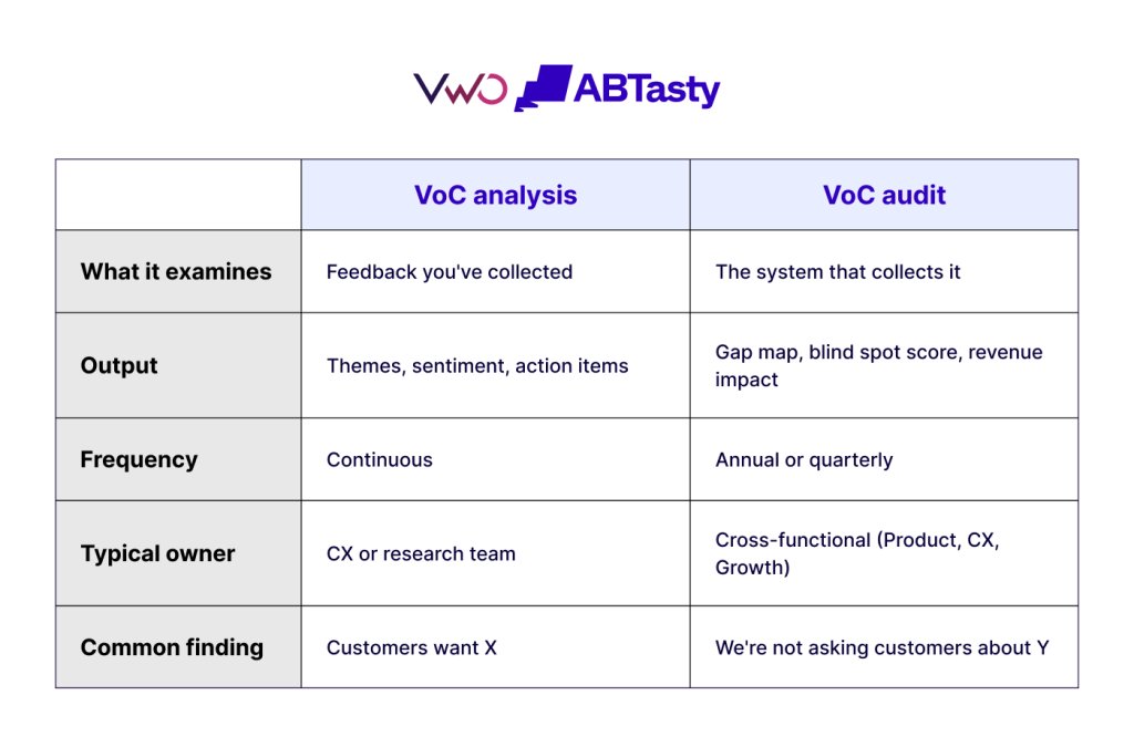
It is fundamentally different from a VoC analysis, which interprets feedback you’ve collected: what customers said, what themes emerged, and what actions to take.
A VoC audit evaluates the system itself, what you’re measuring, what you’re not, and where the blind spots live. Most teams have a VoC analysis process. Few have ever run an audit.
The distinction matters because most customer friction is invisible to a VoC analysis. If your survey didn’t ask the right question at the right moment, the feedback isn’t in the dataset to analyze. The audit finds those structural gaps before they cost you another quarter of unexamined churn.
Why most VoC programs have blind spots (and why they’re expensive)
Most VoC programs are built incrementally. A survey goes live for one campaign. NPS is added when a board member requests it. A new feedback widget ships with a redesign. Over time, the program becomes a patchwork of channels nobody designed as a system, and the gaps between channels are where the friction lives.
Three structural patterns produce the most expensive blind spots:
Support tickets as the primary signal:
Tickets only capture friction that users decided was worth complaining about. They miss the much larger volume of users who hit the same friction point and simply left. Classic research from TARP / Lee Resources, widely cited in CX literature, suggests that for every customer who complains, roughly 24 others stay silent and disengage, which means a healthy ticket queue can coexist with a serious retention problem.
Cadence-based surveys instead of event-based:
Quarterly NPS captures customer sentiment at a moment that has nothing to do with the customer’s actual experience. The customer who churned three weeks ago isn’t in your last NPS pull. The customer who’s about to churn answers your survey based on whatever happened recently, not what’s happening right now in the product. An event-based survey triggered at checkout abandonment, mid-onboarding when a user gets stuck, or at the moment a feature fails captures intent in real time while it still conveys what the customer actually felt.
Closed-form questions where the real signal is open-text:
A dropdown gives you categories, but an open-text field gives you the actual complaint. For instance, when surveying customers about pricing, choosing an option of ‘Too expensive’ tells you nothing useful.
How to run a Voice of Customer audit (the 6-step framework)
A complete audit takes between 2 and 6 weeks, depending on company size.
The interactive VoC audit calculator gives a directional version in two minutes, useful for sizing the opportunity before committing to a full audit. The full framework runs through six steps.
Step 1: Map every customer feedback channel currently active
List every channel where customers leave their feedback. Support tickets, NPS, in-product surveys, exit surveys, G2 reviews, app store ratings, sales call notes, CS QBR notes, social mentions. Most teams miss at least two or three of these when they first do this exercise. For each one, capture the basics: how often it runs, what the response rate looks like, who owns it, and where the data sits.
If this exercise produces a list of fewer than seven channels, you’ve probably missed some. If it produces more than fifteen, you have a consolidation problem; too many channels usually mean none of them are owned well.
Step 2: Identify what each channel is structurally good at and bad at
Every feedback channel has its own strengths and blind spots. Support tickets surface the loud, severe issues, but miss the quiet users who just leave. NPS shows you whether sentiment is moving up or down, but not why. Session recordings show what users did, not what they were thinking.
Map your channels against the questions you actually want answered: Why did users drop off at this stage? What were they trying to do when they hit friction? Why didn’t your happy NPS promoters expand? What pushed silent churners out? Who were the almost-converted users comparing you to? Wherever multiple channels answer the same question, you have redundancy. Wherever no channel answers a question, you have a blind spot.
Step 3: Measure the blind spot quantitatively
This is where most audits stall. Teams jump from ‘we have gaps’ to ‘we should buy something’ without ever sizing the gap. Don’t skip this part without numbers.
First, calculate your ticket iceberg ratio: tickets per customer per month, benchmarked against the 0.1–0.5 band typical for growth-stage SaaS. A ratio at or below the top of that band combined with elevated churn is the classic signature of silent disengagement.
Second, calculate your preventable churn gap: the amount by which your current churn exceeds the peer median for your stage and vertical. Recent SaaS Capital data places growth-stage B2B SaaS at roughly 3.7% monthly customer churn; scale-stage at 2.5%; enterprise at 1.5%. Your gap above the peer benchmark is the share of churn that’s structurally addressable.
Third, calculate your funnel stage exposure: which stage of the customer journey concentrates the most leakage, and what the typical recovery upside is at that stage. Activation cliff drop-off has the highest recovery potential in PLG businesses; trial-to-paid sits second; renewal-window churn is third.
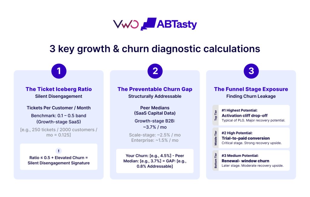
The Pulse audit calculator does the three core calculations for you and returns a personalized blind spot score (0–100) along with a revenue leakage estimate.
Step 4: Diagnose the friction patterns
A score tells you how much signal you’re missing. It doesn’t tell you which friction is causing it. The next step is identifying the specific patterns showing up in your data, usually two to four per company, each needing a different fix.
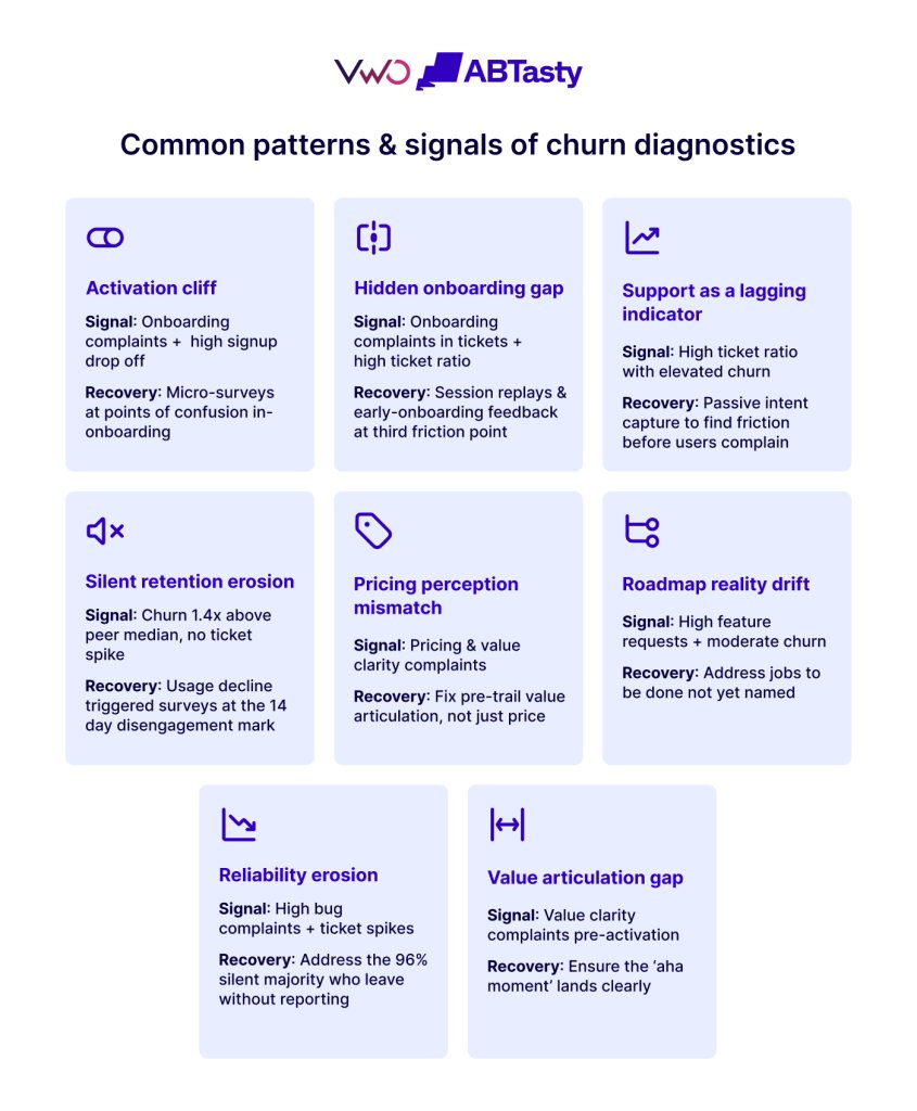
Common patterns and their signals:
- Activation cliff: drop-off between signup and activation, paired with onboarding complaints. Fix: micro-surveys triggered at the moment of confusion.
- Hidden onboarding gap: onboarding complaints in your tickets, plus a high ticket-per-customer ratio. Fix: session replay and feedback at the third friction point.
- Support as a lagging indicator: high ticket volume alongside elevated churn. Fix: passive intent capture (rage clicks, repeat searches, abandoned flows) that catches friction before it becomes a ticket.
- Silent retention erosion: churn well above peer median, but no spike in tickets to match. Fix: surveys triggered by usage decline around the 14-day disengagement mark.
- Pricing perception mismatch: pricing complaints, often alongside value-clarity complaints. The fix is rarely lowering the price; it’s making the value land earlier, usually pre-trial.
- Roadmap-reality drift: feature-request complaints, with churn slightly above peer. Customers are using product language to describe a job-to-be-done you haven’t named yet.
- Reliability erosion: bug complaints rising, ticket volume spiking. The reported bugs are the visible 4%; the silent majority just leaves.
- Value articulation gap: “I don’t get what this does” complaints concentrated before activation. The aha moment isn’t landing
Step 5: Prioritize by leverage, not severity
The natural instinct after a friction diagnosis is to fix the worst-looking problem first. That’s usually the wrong move. Start instead with the highest-leverage pattern, the one where a small intervention produces the biggest measurable impact within a quarter.
For most growth-stage B2B SaaS teams, that’s the activation cliff. A 5% lift in activation rate compounds across every cohort from the day you ship it, which is why it beats almost any retention play. A 10% churn reduction only helps the customers you have today; activation lift helps everyone you’ll ever acquire.
For each pattern you prioritize, build a 30/60/90-day plan:
- Days 1–30: what gets instrumented
- Days 31–60: what gets analyzed
- Days 61–90: what gets shipped and measured
Step 6: Close the loop with experimentation
This is the step that separates an audit from a checkbox exercise. Every friction pattern becomes a hypothesis. Every hypothesis becomes an experiment. Every experiment produces a real recovery number that feeds into your next audit.
This is also what turns the audit from a one-time diagnostic into an operational rhythm. Teams that run audits quarterly compound their gains over time. Teams that run one and stop tend to lose roughly half their initial gains within two quarters as the program quietly drifts back to where it started.
What a complete voice of customer audit measures (the diagnostic frame)
The audit produces four primary outputs. Each maps to a specific business decision.
Revenue leakage estimate:
A dollar figure for the monthly revenue lost to addressable customer friction. This is the number CFOs respond to. Sizing methodology is openly published:
conversion loss (traffic × stage-leak coefficient × ARPU) plus preventable retention loss (customer base × preventable churn × ARPU × LTV horizon).
Blind spot score (0–100):
A weighted composite of four sub-scores: silent churn component, ticket iceberg component, funnel vulnerability component, and complaint breadth component. The score positions you against peer benchmarks and tells you how much customer signal you’re systematically missing.
Friction patterns ranked by confidence:
The two to four patterns your inputs most strongly indicate, ranked by computed confidence score, with severity tiered from ‘watch’ through ‘critical.’ Each pattern has a specific intervention path.
Conversion and retention upside:
Conversion upside estimates the revenue you’d recover by closing the friction at the funnel stage where users are currently dropping off, while retention upside estimates the revenue you’d recover by bringing your churn down to the peer-median benchmark for companies your size.
A good audit produces all four. An incomplete audit produces just the first one, which is why most “VoC calculators” feel like marketing, not diagnostics.
Voice of customer audit vs. customer experience audit: what’s the difference?
A customer experience audit examines the experience a customer has across journey stages, usually qualitatively, often via journey mapping and observational research. A Voice of Customer audit examines the measurement system that captures what customers think about that experience. The two are complementary but distinct.
CX audits answer: “Is the experience itself broken?”
VoC audits answer: “Are we even measuring whether it’s broken?”
Most companies need both, and most run neither. A practical sequence is to run the VoC audit first because it identifies where you’re flying blind, then commission targeted CX research in the specific journey stages where the VoC audit revealed your measurement is thin.
How Pulse fits into the audit process
Pulse is a Voice of Customer platform designed specifically to close the blind spots that a typical audit surfaces. Three capabilities map to the most common audit findings:
Contextual in-product feedback at the moment of friction:
Most blind spots come from cadence-based surveys, missing the moment that mattered. Pulse triggers micro-surveys based on user behavior at drop-off, activation, and usage decline, capturing intent in the moment rather than weeks later via email.
Automatic open-text categorization:
The hardest blind spot to close manually is the volume of free-text feedback that goes uncategorized. Pulse’s AI categorizes responses by theme and sentiment automatically, surfacing patterns in minutes rather than requiring weeks of analyst time.
Integration with behavioral data and experimentation:
A VoC audit is only useful if its findings get shipped. Pulse connects to Insights (the behavioral analytics layer that shows what users do) and Testing (the experimentation layer that ships and measures fixes), turning audit findings into hypotheses, experiments, and shipped recovery, all within one workflow.
Common questions about voice of customer audits
How often should I run a Voice of Customer audit?
Annually, for most companies, quarterly, if you’ve recently launched a new product, shifted pricing, entered a new segment, or had a churn spike. The first audit always surfaces the most. Subsequent audits typically focus on whether last quarter’s interventions actually closed the gaps they targeted.
Who in my company should own the VoC audit?
The audit is cross-functional by design. Common ownership models: CX leads the audit with Product and Growth as participants; Product leads with CX as a participant; or a research/insights function leads with both as stakeholders. What matters is that a single owner is accountable for findings being acted on, not that the owner sits in any particular function.
What’s the difference between a VoC audit and an NPS analysis?
NPS analysis examines one specific feedback channel (the NPS survey). A VoC audit examines whether the full system of feedback channels, NPS included, is catching what your customers actually experience. NPS analysis answers “what’s our score?” A VoC audit answers “what’s our score missing?”
How long does a complete VoC audit take?
A directional audit using a calculator takes 2 minutes. A self-led full audit using the 6-step framework typically takes 2-4 weeks for mid-market companies and 4-8 weeks for enterprise. Vendor-led audits run 6-12 weeks. The bottleneck is usually step 1 (mapping all channels), not the diagnostic work itself.
Can I run a VoC audit without specialized software?
Yes, the framework above is software-agnostic. The friction comes in step 4 (diagnosing patterns) and step 6 (closing the loop), where manual analysis at scale becomes expensive in analyst time. Software helps; it doesn’t replace structured thinking.
What’s a “good” blind spot score?
Below 35 is low; your measurement is robust relative to peers. 35-55 is moderate, a common pattern of underinstrumentation. 55-75 is high; you’re missing a significant signal and likely have addressable revenue at risk. 75+ is critical; your measurement gap is wider than 75% of comparable companies, and the patterns are typically systemic rather than tactical.
How is “revenue leakage” calculated?
The estimate combines two components: conversion loss (visitors who didn’t convert at the named funnel stage × ARPU × stage-specific recovery coefficient) and preventable retention loss (customers who churn above peer benchmark × ARPU × LTV horizon × VoC capture rate). The full methodology is published openly so it can be validated by your finance team.
What “voice of customer” actually means (and why the audit framing matters)
Voice of the customer (VoC) is the systematic practice of capturing, analyzing, and acting on what customers say about their experience with a product or service. The term covers both the data sources (surveys, in-product feedback, support interactions, reviews, behavioral signals) and the operational practice of turning that data into measurable business outcomes.
The category has matured significantly. Modern VoC platforms support in-product surveys, website surveys, mobile feedback, NPS, CSAT, open-text responses, and external survey distribution, often with AI-driven analysis layered on top. The strategic shift over the past two years has been from generic “feedback collection” toward contextual, behaviorally-triggered capture combined with automated theme extraction.
The audit framing exists because the maturity of the tooling has outpaced the maturity of how most companies use it. Buying a VoC platform doesn’t automatically close blind spots; instrumenting it properly does. The audit identifies what to instrument, in what order, at what stage of the journey, turning the platform from a cost center into a measurable revenue lever.
Run your first audit in 2 minutes
The interactive VoC audit calculator takes about two minutes to complete. It returns a personalized blind spot score, an estimated revenue leakage figure with confidence bands, and your top friction patterns ranked by computed confidence, the same diagnostic framework described in this guide, applied to your numbers. Try it out now.
For teams running a first audit, the practical sequence is: use the VoC audit calculator to size the opportunity, run the full 6-step audit framework to diagnose the patterns, then evaluate whether your existing tooling can close the blind spots the audit revealed. If contextual in-product feedback is one of the gaps, request a Pulse demo; it’s the layer that closes that specific category of blind spot.